

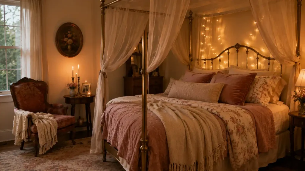
I redid a friend’s bedroom two years back. Nothing huge new linens, warmer lighting, one decent chair instead of the desk nobody ever used. She called me a month later, said the room finally felt like “theirs,” not just hers with someone else’s clothes shoved in the closet. That’s basically the whole idea behind a lover house. Not candles and rose petals on a random Tuesday. A home built around two people actually sharing one space, well.
Here’s what that looks like, room by room.
Where This Idea Even Comes From:
Architecture’s been chasing this for two centuries now:
Romantic Style architecture ran America from 1820 to 1880, Greek Revival holding the tightest grip between 1830 and 1850. Gothic Revival, Italianate, the whole Exotic Revivals movement they all reached back toward medieval architecture and renaissance influence, further still toward classical Greek roots. Wrought iron detailing. Steep gables. Pointed arches. Gingerbread trim carved with way more care than it needed. None of that was decoration for its own sake. It was supposed to feel like something.
One actual building gave this idea its name:
Isla Architects build a house in Santa Maria, Mallorca. They call it Lover’s House. Marta Colon and Juan Palencia lead the project, pulling from Spanish architectural heritage, nodding hard toward Jose Antonio Coderch’s earlier island work. Wallpaper magazine covers it textured, colourful, built around Mediterranean floor plans, terra cotta tiles, adobe walls, balconies that open the place outward instead of sealing it shut. Balearic island architecture, doing what romantic design has always tried to do. Making shelter feel like closeness.
Color Sets the Mood Before You’ve Touched a Single Piece of Furniture:
A romantic palette leans soft nudes, pastels, dusty pink, blush. Baby pink and lavender in small doses. Periwinkle and old rose sit fine next to muted turquoise when a room needs a bit of contrast but can’t lose the softness.
Dreamy neutrals and soft neutrals carry most of the weight in a room like this. Warm neutrals with red undertones feel inviting in a way cool gray just never does, no matter how you style around it. Softened terracotta, muddy blush warmth without tipping sweet. Cream, warm white, taupe round out a base for everything bolder to stand against.
Dusty blush against warm sage works better than it sounds on paper. Deep navy, plum, mauve that’s moody jewel territory, for anyone wanting drama at night rather than softness in the morning. Soft blush pink and antique rose go the other direction entirely, gentler, closer to sunrise than candlelight.
Sponge-painted walls were everywhere in the eighties. They’re creeping back now, thankfully with more restraint. Color psychology here isn’t theory undertones that hold space, warm ones especially, create color that actually lingers instead of sitting flat against a wall. The same palette reads as luminous in the morning and seductive by evening, depending purely on how light hits it that hour. Tonal blending keeps a romantic pastel palette cohesive without forcing every surface into an exact match.
Furniture Shapes That Soften Everything on Sight:
Curves do more than people give them credit for:
Romantic furniture curves, undulating lines, no sharp edges anywhere in the main sightline a room reads softer the second you walk in, before color or lighting even register.
The bed’s still the emotional center of the room, no contest:
Four-poster, canopy still the clearest romantic signal a bedroom can send. Brass canopy frames bring warmth metal usually doesn’t carry. Style it right with the right textiles and the bed stops being furniture. It becomes the room.
Seating built for two, not for one:
A chaise or daybed gives a couple somewhere to sit that isn’t the bed. A tufted armchair works for someone reading while the other person does literally anything else nearby. His-and-hers shows up in furniture, not just decor choices. Intimate grouping matters more than any single statement piece ever will.
Smaller pieces tie the whole room down:
A china hutch or vintage dresser drags in some history against all that soft new fabric everywhere else. Wingback chairs and a claw-footed tub push the same feeling into the bathroom. Round footstools, spherical lamps, oval mirrors same curved logic, just scaled down.
Textiles Quietly Do Most of the Emotional Work Here:
Silk sheets and plush fabric set the tone the second anyone actually touches them. Faux fur and velvet cushions photograph flat but feel completely different in person there’s a real gap between how this stuff looks online and how it feels under your hand. Throw pillows and a chunky knit blanket layer in warmth without much effort at all.
Layered linens matter more than any one fabric choice on its own. Bouclé, washed linen, a soft pile rug vintage rugs especially bring in texture variety a flat room would otherwise lack entirely. Lace and floral patterns echo that gingerbread trim from a century back, just softened into cloth instead of carved into wood.
There’s an actual rule for pillow stacking worth knowing. Back layer at 26×26. Middle layer at 24×24. A smaller lumbar pillow up front. Most people get this by accident or skip it entirely. Bedding layered properly, finished off with a plush duvet, turns a bed into the actual centerpiece of the room rather than just something you sleep on.
Lighting Decides Whether Any of This Actually Feels Romantic:
Candlelight is still the fastest, cheapest mood shift available. Taper candles, pillar candles, a grouping on a mantel five minutes of work does more than most lighting renovations manage in a month. A crackling fireplace adds warmth you can feel and warmth you can only describe there’s something to fire that no bulb fully replicates, and that’s not really up for debate.
An ornate chandelier paired with warm lamp light gives you the layered effect most romantic rooms are reaching for and missing. Warm fairy lights, not cool white ones, work especially well tucked behind a backlit headboard. 2700K. Write that number down if you’re shopping for bulbs anything cooler reads clinical, not intimate, full stop.
Brass wall sconces and vintage fixtures add gold detail that catches candlelight beautifully once it’s dark out. Billowing curtains diffuse daylight the same way a dimmer switch handles lamp light at night. A mirror angled to catch candlelight doubles its effect for free, no extra bulb required.
Accessories Are Where the Actual Story Shows Up:
Fresh flowers, rose petals, white roses obvious, sure, but they still work every time. Floral arrangements next to antique botanical prints bring nature in without going too literal about it. Dried florals last longer and read quieter, more lived-in than anything fresh ever manages.
A gallery wall built around a couple turns a hallway into a timeline nobody else could replicate. Family photos. Vintage frames. Hand-cut French mattes if you’re going all in. It works specifically because it’s personal that’s the entire point of doing it this way instead of buying matching prints from a catalog.
An oversized mirror adds light and depth in one move. Organic vases and a woven basket holding a houseplant or terrarium bring texture without much upkeep required. But the stuff that actually matters most here: couple mementos, travel souvenirs, heirloom pieces, coffee table books picked up together on some trip neither of you fully remembers anymore. No catalog piece tells that story. It can’t.
Design Principles Holding the Whole Thing Together:
Warmth and intimacy aren’t really decor categories. They’re the actual goal everything above is working toward, full stop. Emotional connection comes from layering texture, soft mellow color, and a cocooning effect that makes a room feel smaller and closer instead of open and echoing back at you.
Comfort-focused design beats anything trend-driven, every time. Balance between independence and connection shows up in the smartest layouts connected and independent space existing in the same room without fighting each other for attention. Organic minimalism and material honesty keep all that layering from tipping into actual clutter.
Biophilic design nature indoors, treated as emotional strategy rather than decoration fits naturally here. Feng shui romance, mirrors and candles and flowers placed with real intention behind them, gives some of this an older logic worth respecting rather than dismissing. Love nest architecture and romantic floor plans increasingly account for balcony space and kitchens built for two people cooking together, not one person working alone while the other waits somewhere else.
Conclusion:
A lover house isn’t one trick repeated. It’s color picked for emotional temperature, furniture shaped to soften a room, textiles layered for warmth, lighting tuned to 2700K instead of anything clinical, and accessories that actually mean something to the two people living there. The real Lover’s House in Mallorca proves this works at full architectural scale. The same logic scales down just fine to one rented bedroom with new sheets and a better lamp. Start with light and color. Let texture and personal objects handle the rest. This was never about grandeur. It was always just about making a shared space feel genuinely shared.
Frequently Asked Questions (FAQ’s)
A lover house is a home designed around two people sharing space comfortably, rather than simply filling rooms with romantic decorations. It uses thoughtful layouts, warm lighting, soft materials, personal objects, and areas that support both closeness and individual routines.
A romantic bedroom puts more emphasis on atmosphere through layered bedding, curved furniture, warm colours, tactile fabrics, and softer lighting. A conventional bedroom may focus mainly on function, while lover house design also considers how the room feels emotionally for the people using it.
Start with warm 2700K lighting, layered linens, softer curtains, a comfortable chair, and a few meaningful personal objects. Small changes in colour, texture, and lighting can create intimacy without changing the room’s structure or buying expensive furniture.
Warm neutrals, dusty blush, terracotta, sage, cream, taupe, mauve, and antique rose work naturally with romantic interiors. Deeper shades such as plum or navy can add evening drama when balanced with softer fabrics and warm lighting.
Comfort and shared use should come before decoration. Plan storage, seating, lighting, and personal areas around both people’s routines, then use textiles, photographs, travel mementos, and other meaningful pieces to make the space feel genuinely shared.

22 thoughts on “Lover House: Designing a Home That Feels Like Two People Actually Live There”