

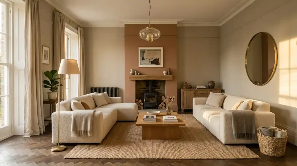
Most living room ideas conversations start in the wrong place. They start with the sofa colour or the rug size or whether the accent wall should be sage green or terracotta and those are all real decisions worth making, but they’re the third act of the process, not the first. The rooms that consistently feel right, that visitors notice and residents actually use, are the ones where someone thought carefully about layout, light, and function before they opened a single product tab.
I’ve rearranged enough living rooms in Victorian terraces in Edinburgh, open-plan new builds in Manchester, studio flats in London where the room is also the bedroom and the dining room and the home office to know that the single most common living room mistake is buying furniture for a room that hasn’t been understood yet. The sofa arrives and the problem announces itself immediately. Too wide for the wall it ends up against, too deep for the floor space left in front of it. The room starts looking like somewhere you pass through rather than somewhere you’d choose to sit. Then the rug purchased at what seemed like a reasonable size turns out to be roughly the dimensions of a doormat relative to everything around it.
This guide reverses that sequence. Layout and light first. Furniture scale and function second. Colour, textiles, and finishing details last where they belong.
The Layout Decision That Drives Every Other Choice
Layout is the part of the living room conversation that gets skipped fastest and costs the most when it’s wrong. Whether the furniture actually serves the people using the room — whether it creates a space worth sitting in comes down almost entirely to placement. And the placement error that shows up most consistently: everything shoved back against the walls, clearing a patch of empty floor in the middle, which does the opposite of what was intended. The room doesn’t feel bigger. It feels like a lobby.
Floating furniture pulling the sofa and armchairs away from the walls by even a few inches, creating a conversation area with the seating oriented toward each other rather than arranged in a ring around the perimeter changes the entire register of a room. The traffic flow still works. The visual balance improves because the eye reads the space as a composed zone rather than a collection of objects pressed to the edges. On the floor plan, this looks counterintuitive. In the room, it feels immediately right.
The focal point question shapes the layout from the start. Every functional living room has one a standard fireplace, a chimney breast, a TV unit, a bay window seat, a statement wall. Arrange the seating to face it, not to face each other across an empty floor. If the focal point is a fireplace with the TV mounted above it, the sofa wants to sit directly opposite with side tables and armchairs completing the conversation area. If the focal point is a large window with a garden view, the seating wants to orientate toward it rather than parallel to it.
Open plan rooms swap one problem for another. No walls means no natural definition the living area bleeds into the kitchen, the dining zone goes wherever the table ends up, and the whole floor plate reads as one unresolved space. Furniture has to draw the lines that architecture didn’t bother with. Turn a sectional so its back faces the kitchen end and something clicks suddenly there’s a room within the room, a legible boundary that didn’t require a single nail in a wall. A pendant light over the dining table and a floor lamp in the living corner reinforce the zoning through light rather than through barriers a far more elegant solution than trying to separate functions that share the same air.
Furniture Scale Is the Problem Nobody Admits to Until It’s Too Late
The living room furniture conversation almost always focuses on style when it should start with scale. A modular sofa or L-shaped sectional in the right dimensions for the room beats a larger sofa in the wrong dimensions for it every single time.
Undersized rugs are responsible for more rooms that almost work but don’t than almost anything else. The furniture hovers above it without connecting to it, the arrangement reads as a collection of separate objects rather than a group, and the whole seating zone looks like it landed there by accident rather than intent. Size the rug correctly — front legs minimum, all legs better — in jute, wool, or any natural material with enough texture to hold the eye without competing with what sits on top of it. That one decision pulls the layout together more reliably than anything you could hang on the wall.
Nesting tables and ottomans earn their keep in smaller rooms precisely because they do two jobs without taking up the space of one. The standard coffee table is a significant floor commitment in a compact apartment living room, that commitment often isn’t worth making. An ottoman serves as coffee table and storage simultaneously a multifunctional furniture approach that the best small space living rooms apply consistently. The same logic applies to sofas with storage under the chaise section, sideboards with closed cupboards that hide the visual noise of everyday life, and built-in shelving in alcoves either side of a chimney breast that takes advantage of the dead space every period property living room contains.
The curated maximalism trend that’s defining living room ideas in 2026 sits in direct conversation with the collected over time aesthetic that designers keep returning to. Matching furniture sets sofa, loveseat, and accent chair in the same fabric from the same range read as generic and staged rather than considered and personal. Mixed silhouettes, combined fabrics, vintage furniture from different periods placed alongside contemporary pieces, thrifted antiques with genuine patina alongside new investment pieces this combination produces the depth, warmth, and story that a room needs to feel inhabited rather than installed.
Colour, Light, and the Sequence That Most Living Room Ideas Get Backwards
Get the layout right first, the furniture scaled correctly second, and then colour does something it simply cannot do in a room that hasn’t been sorted underneath it it finishes the room rather than papering over its problems.
The reason warm neutrals keep showing up in every serious living room conversation in 2026 has nothing to do with trend cycles. They hold across lighting conditions that change throughout the day, they don’t fight the textiles or the floor or the objects placed against them, and they give layered rooms the quiet backdrop that lets the interesting details read clearly. Greige walls, warm white trim, cream upholstery with olive green and terracotta cushions playing against a wide-plank oak floor call it dated in ten years if you like, but I’d bet against it.
The bold living room end of the spectrum has its own logic, and colour drenching painting walls, ceiling, woodwork, and alcoves in a single saturated field of rich navy, forest green, or chocolate brown works in rooms that can absorb that level of commitment. A Victorian terrace living room with high ceilings, original cornicing, and generous natural light handles colour drenching magnificently. A north-facing apartment living room with a single small window doesn’t, and no amount of confidence in the colour choice corrects the darkness that follows.
Feature wall and accent wall logic applies most effectively when the wall being treated is the one the room’s natural focal point already sits against. A chimney breast painted in a deeper tone than the surrounding walls uses colour to reinforce the room’s existing architectural hierarchy rather than imposing a new one. Wallpaper with an oversized floral, bold geometric pattern, or the library wrap treatment floor-to-ceiling built-in bookshelves covering an entire wall in a contrasting colour adds the personality-led design quality that 2026 living room trends keep coming back to: spaces that feel collected over time rather than assembled in a weekend.
Layered Lighting Is the Most Underestimated Living Room Idea on Every List
One light in the ceiling is not a lighting scheme. It’s a placeholder that a lot of rooms never graduate past. Everything gets flattened under it surfaces lose depth, the room loses mood variation, and by eight o’clock in the evening the space feels less like somewhere to relax and more like a staff canteen. In years of walking through finished living rooms, I haven’t once found a genuinely good one operating on a single overhead source.
The layered version looks like this in practice: a semi-flush or statement chandelier handles the general level, a floor lamp beside the sofa and a table lamp on the sideboard create the warm, directed pools that make a seating area feel inhabited rather than illuminated, and under-shelf LEDs or concealed strip lighting in built-in units turn a bookcase from storage into something worth looking at after dark.
Dimmer switches across every circuit in the living room are the single most cost-effective living room upgrade available. The same room on full brightness for a family evening and on 30% brightness for a quiet night feels like two different rooms which is the point. Light is the cheapest room transformation tool in the box, and it requires no new furniture, no fresh paint, and no delivery slot.
Hang the curtains above the window frame rather than from it well above, ideally almost to the ceiling and let them fall to the floor. Both the window and the wall gain height instantly. It’s a particularly useful trick in Victorian terraces and lower-ceilinged apartments where the actual architectural clearance doesn’t give you much to work with. Sheer curtains or roller blinds in a light fabric let the daylight through properly; heavy velvet drapes do not, and a dark north-facing room hung with velvet is a commitment most people regret by February. The mirror opposite the main window catches and redistributes the light further into the room than any paint colour manages on its own.
The Finishing Layer That Makes It Feel Lived In
The textiles, plants, art, and accessories that come last in the sequence are not trivial they’re the layer that converts a correctly planned room into a room with a personality. But they only work once everything underneath them is right.
Boucle upholstery on an accent chair, velvet throw pillows on a linen sofa, a wool rug layered over a jute base rug, linen curtains falling to the floor the tactile richness of mixed natural material textiles is what the organic modern and quiet luxury directions both rely on. The eye reads these combinations as sophisticated even when the individual pieces are modest in price, because it’s the combination and the layering that produces the effect rather than any single expensive purchase.
The 2026 trend toward coloured glass across lighting, furniture, and decorative objects amber glass pendants casting warm pools of tinted light, cobalt and emerald glass objects catching the window light on a shelf, fused glass tabletops that shift in depth depending on the angle brings the sensorial composition quality that designers identified at Milan Design Week 2025 as the direction the best living rooms are moving toward: rooms conceived as experiences for all the senses rather than backdrops for a sofa purchase.
Gallery walls, statement art, and vintage mirrors earn their place in a room that’s already balanced they add story and visual interest without being asked to compensate for a layout problem underneath them. Coffee table books, sculptural objects, and shelf styling vignettes are the punctuation of a room that’s been written well. They don’t make a badly structured sentence better. But in the right room, they’re exactly what was missing.
Conclusion
Living room ideas only become living room results when they’re applied in the right order. Layout and light are the decisions that determine whether a room works. Furniture scale and function are the decisions that determine whether it lives comfortably. Colour, textiles, and finishing details are the decisions that determine whether it has a personality worth spending time with. Reverse that sequence start with the cushions and end up wondering why the room still feels wrong and no amount of vintage finds or statement lighting corrects the structural problem underneath them.
The rooms that hold up across years of daily use and changing tastes are never the ones that chased a trend hardest. They’re the ones where the sofa is the right size for the floor plan, the rug is large enough to anchor the seating group, the lighting does three jobs rather than one, and the colour was chosen after the room was understood rather than before. That outcome is available at almost any budget and in almost any room size from a compact north-facing flat in Manchester to an open-plan new build in the suburbs as long as the decisions that actually drive how a room feels are made before the ones that determine how it photographs.
